Why My Logo Means Nothing and Everything

There is nothing more daunting than the prospect of failing a first impression, especially if you're like me and WILL think about it for the rest of your life when you're trying to sleep.
Creative endeavors are no less petrifying.
You labor over that first word, first note, first stroke of the brush. You wrestle with it until it submits to your creative will and then, the doubts creep in. "Does this actually represent me? If this is the first thing they see, will they understand? Is this good enough?"
I've been there too many times. I obsess over the details ad nauseum; I try to see how another person would view it versus another versus another until there is a council within me passing judgement on a thing that has yet to exist.
Once, in my college drawing class, we were told to sit in front of a mirror and draw ourselves as best we could, one of many portraits we would do in the semester. I sat there and studied myself, aiming to draw my face as accurately as possible. I would sketch a line for my chin, then erase it. Too heavy on the pencil. Attempt the eyes, erase it. Didn't feel right. Add a nose, erase it. Wrong shape. Again and again, until finally my teacher and nearest classmate couldn't help but notice the excessive eraser shavings on my easel.
"Stop erasing and just draw."
I've been thinking about publishing my own words since I was a child. I thought social media would be my way in. The first few years of having a Facebook account was full of multiple daily posts with jokes I had thought of, discussion questions that hardly gained traction, lengthy prose on current fixations, excerpts from short stories I was writing. At some point, despite the number of places I had at my disposal to share my thoughts, it all just seemed to come back empty. Or worse, be misunderstood.
So when the idea of a blog finally arrived at the mind palace, it was not exactly given first class treatment. What's the point if everyone is doing it? What do I have to say? Why would anyone care? I'm old enough now to be cynical, yet young enough to hope. "Maybe someday," I said. That someday became today when this post was dropped in my inbox. Something finally pushed through the years of doubting and denial. You would think with all this buildup, all this weight, that when it came time to craft a logo it would be full of meaning and purpose. A thing that honored the struggle it was to arrive where I am.
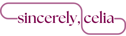
It took me about 10 minutes. Maybe 15, tops. I opened Canva, hid my eraser and just drew.
It's the blog name, with a curvy line around it. The only way it could be simpler is if I removed the line.
That's not to say it lacks meaning. When I showed my husband, he said the curving path of the line reminded him of a stringed instrument. The pattern of it is reminiscent of an infinity symbol, yet its ends never meet and the negative spaces are asymmetrical. I picked a casually serifed font because I generally despise sans-serif except in certain cases. I picked the plum color because it's a pleasant, yet not harsh, contrast to a white background. One side has a perfect radius, the other has a bit of a straight end to it. It could symbolize imperfection, and how that can still be beautiful. It could be an abstraction of the path of thoughts, rambling around until they reach their point. It could represent the flourish of a signature, riffing on the blog name's present theme. It could serve to separate the words, to further imply pause between them and encourage pondering.
It can also just be a curvy line.
I don't think it's a crime for something to be both pointless and full of purpose. Analyzing a thing doesn't have to sound pretentious. You can just create and think about what it "means" later. And what if you write that poem, paint that painting, draw that portrait, without coming to any conclusions about its meaning?
Then it can just be art.
It's okay if it's nothing, and it's okay if it's everything.